

Colour of the year 2019

Each year around this time I get excited and it has nothing to do with an overweight bearded guy. Every year around this time all the big colour influencers provide us with their forecasts for the upcoming year colour trends. One of the biggest and well known authorities on the colour is of course Pantone® . Their predictions are heard even by the people not related to colour or trends. According to Pantone® itself the colour of the year is not only about trends, but is a reflection of what’s needed in our world today.
2018 was all about Ultra Violet - enigmatic and mysterious, the symbol of limitless exploration (the colour of night sky) and artistic expression and 2017 we enjoyed Greenery - a symbol of new lie and new hope.
This year's Pantone color of the year? Living Coral.
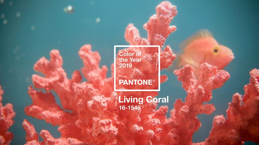
Living Coral, also known as Pantone 16-1546, is a warm, peachy orange with a life-affirming golden undertone. The color evokes vitality and buoyancy; the marine invertebrate get its vibrant tone from the tiny algae living on its surface.
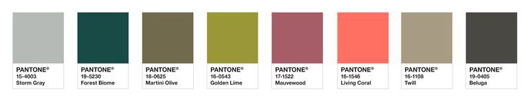
See a few of Pantone's suggested palettes for the hue below:
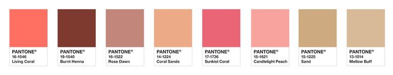
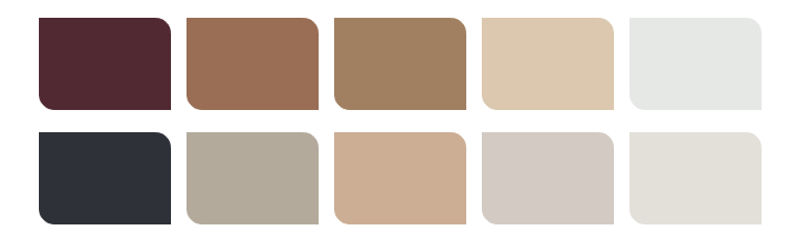
1. The focal point pallette - dominated by subdued earthy colours with "Living Coral" acting as a focal point and a needed pop of colour.
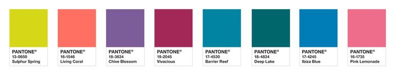
2. Shimmering sunset pallette - a warm and bright pallet where "living Coral" is as the name suggests almost a part of a tropical sunset.
![]()
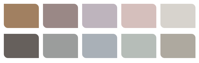
3. The Sympatico palette - or a i call this palette - a skin tone palette. The colours look like they have been picked up from the make-up set where Living Coral is a versatile shade that can be used for lips, cheeks or eyes.
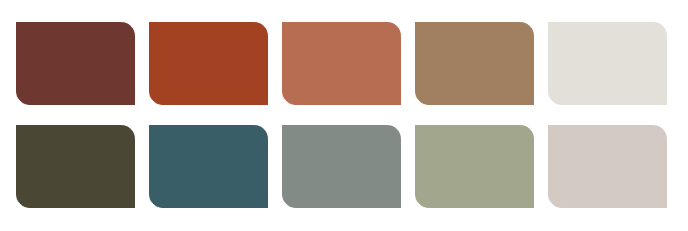
4. The Trippy palette - bright, bold and colourful.
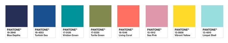
5. The Under the Sea palette - moody but optimistic palette with lots of blue hues that evoke marine vibes.
These days it's not only Pantone giving us colour advice. Pretty much any major company that is somehow related to colour comes out with it's own forcast. For example, Dulux, a company making interior and exterior paint, came out with it's own colour for 2019 - Spiced Honey.
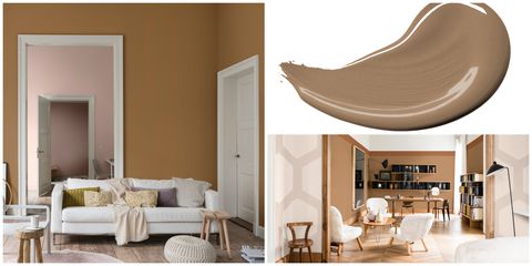
Spiced Honey is a warm amber tone, inspired by the beauty and versatility of honey itself. Spiced Honey can be soothing or calming, cosy or vibrant, depending on the palette you pair it with. According to the experts, the tone encompasses a time for re-energising and optimism after the unpredictably of 2018 – the year ahead, however, is the time for awakening.
Referencing by hue humble materials like cork, hemp, sisal, bamboo and jute Spiced Honey is much "closer" to nature compared to Living Coral.
Dulux has also suggested a set of colour palettes for the home, all including the Colour of the Year 2019, for us to consider.
1. A place to think - a soothing mix of warm neutrals and touches of soft pink
2. Calming place to dream - romantic powder pinks and blues to create a serene and whimsical atmosphere
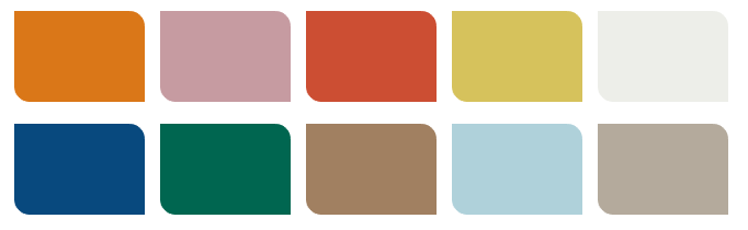
3. Cosy place to love - rich and warm, incorporating deep forest green, bold teal and intense terracotta red.
4. Vibrant place to act - a playful and adventurous palette, making the most of vivid red and green among pale pinks, blues and crisp greys and whites
10 Comment(s)
e
1
Hey there, You’ve done a great job. I’ll definitely digg it and personally suggest to my friends. I am confident they will be benefited from this site.
You produced some decent points there. I looked on the net to the issue and found most people go together with together with your web site.
This may be the correct weblog for everyone who is hopes to discover this topic. You already know a great deal its practically difficult to argue together with you (not that I really would want…HaHa). You certainly put a new spin on a topic thats been discussed for several years. Wonderful stuff, just great!
1
1
1
1
Though some sort of taxation repayment may well appear to be safe, it really is not.
Nice blog and absolutely outstanding. You can do something much better but i still say this perfect.Keep trying for the best.
What’s Happening i am new to this, I stumbled upon this I’ve found It positively useful and it has helped me out loads. I hope to contribute & help other users like its helped me. Great job.
The guidelines you provided here i will discuss extremely precious. It been found such a pleasurable surprise to possess that anticipating me while i wakened today. There’re constantly to the issue as well as simple to understand. Thanks a large amount for the valuable ideas you’ve got shared here.
Leave a Comment